The First
(3/15/2024)
I think being a creator is hard because it's difficult to get yourself to make anything. I doubt it's just me whose brain and body does everything it can not to work on a task. I've spent the better part of two hours this morning trying to get myself to work on this comic. And yet I've spent that time doing equally "productive" things like reading the news or deleting apps off my phone. I don't know what else to say other than making something feels itchy. Making things is good for me, but I am repelled from it. Hopefully that's not a feeling that will last forever.
I have been working on this comic since my vacation from work started Thursday last week. I have the first draft done, and the second draft done. Today I am going to digitize it by redrawing the whole thing in Procreate, pick the colors I want it to use, and then also decide on how I want the words to show up. If I can get this done today, I think I'll be on track to have it before I get back to work on Monday.
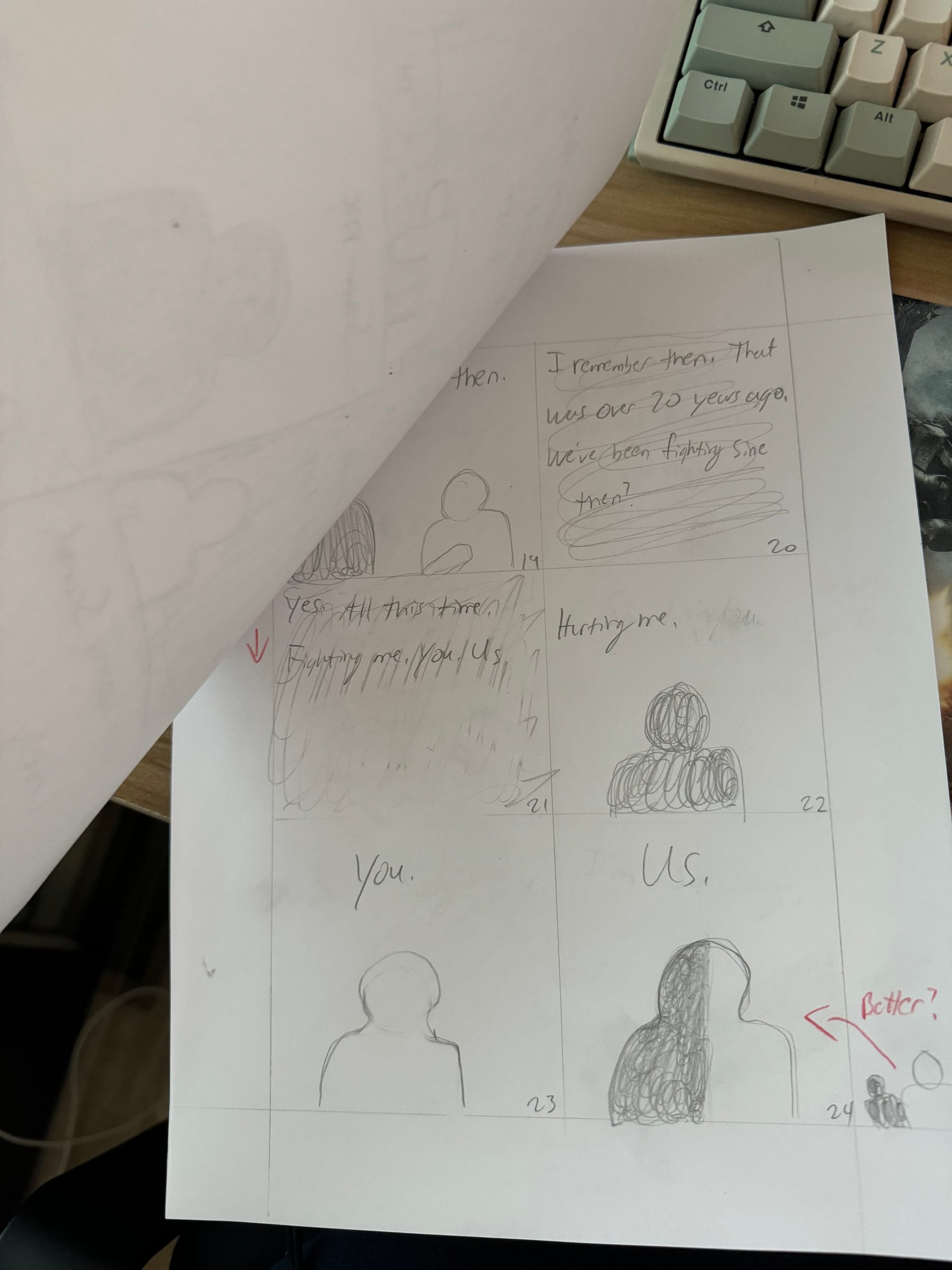
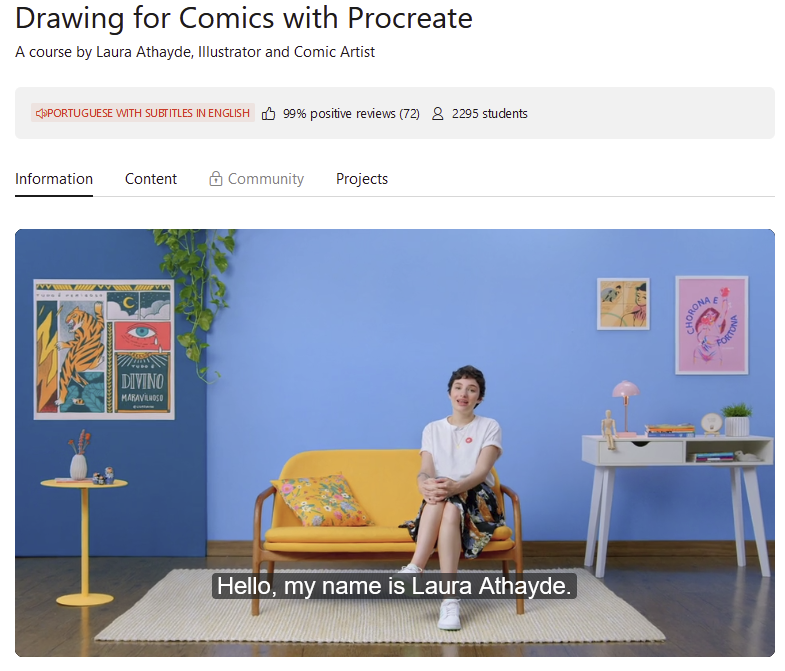
My first order of business was to re-draw this in Procreate while keeping the comic format. I have no idea how to do this efficiently, but thanks to my penchant for buying online courses, Domestika has a course by artist Laura Athayde that taught me exactly what to do.
Part of what I really needed to know was how to make my comic digitally in a format that will still allow me to print it later if I decided to (which I would really like!). So to make sure that was possible, Laura instructs creating your comic in an A3 sized document with 300 DPI and a color profile set to sRGB IEC6. I don't really know what A3 paper is off the top of my head, but a quick search says:
"A3 is the third largest paper size in the A series, defined by ISO 216 standard. It has a width of 297 mm and a height of 420 mm or 11.7 x 16.5 in." - Papersizes.org
397 x 420 is honestly too small for my comic, so I'm going to triple the size to 891 x 1260 and hopefully maintaining the ratio is enough to keep the comic print ready.
The next task is how my panels are laid out. My second draft uses 6 panels, but Laura's course only goes into making 4. I think since this is my first comic, I'll stick to a 4 panel spread and see if it still works within my narrative needs.
The rest of Laura's instructions are super fast, which was annoying. And her recommendation of making the comic in a 4x5 ratio specifically to suit Instagram was not something I was interested in, but I went through with it anyway and finally had something workable.
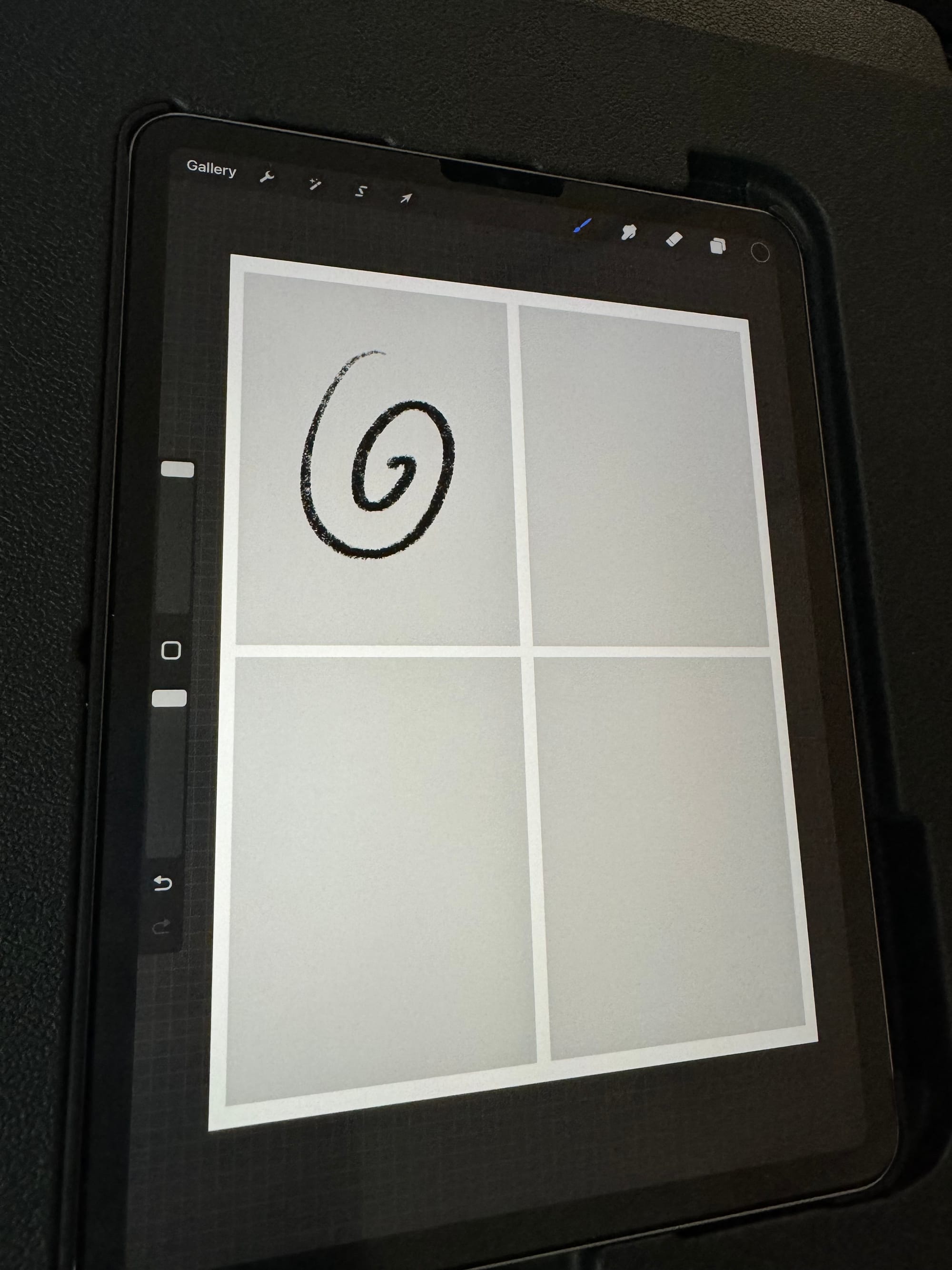
She then draws all 4 panels on one layer. I think I want to make each panel its own layer and then group them into the pages they belong to. I think this would make it easier to edit each one separately if I decide to later. It might be a lot more work than it's worth, but there's only one way to find out.
Text is going to be a huge part of my comic, so I don't want to rely on my own handwriting given how sloppy it looks. Editing text in Procreate is said to be a headache, though, so I watched a few videos on it before giving it a try.
(Side note, I've started trying to force myself to watch a video all the way through first before trying it myself, alongside a re-watch of the video. So many teachers give this advice and I've never taken it because it sounded like a waste of time. But it's actually been helping me lately, so joke's on me!)
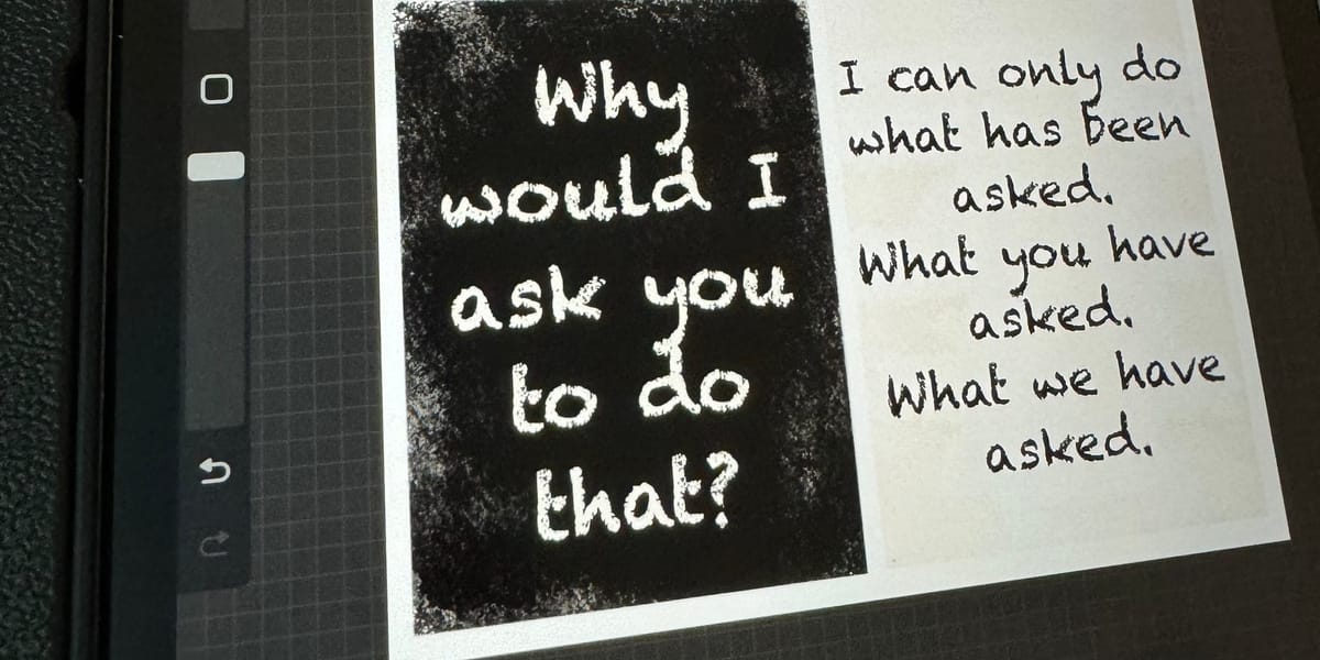
After a about half an hour of fiddling with colors and available font choices, I landed somewhere I liked.
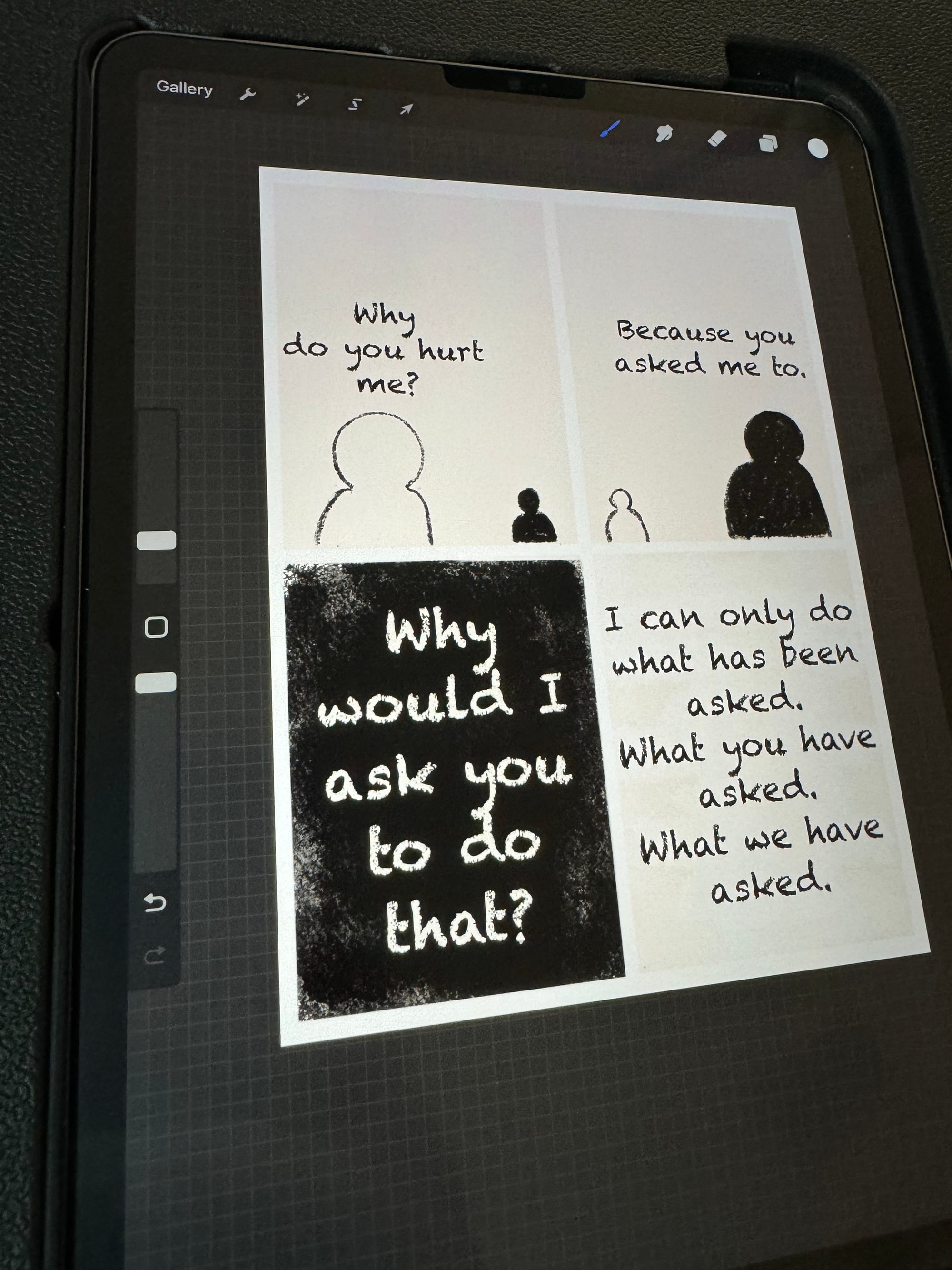
First I changed the grey background to something subtly more paper colored. On screen it looks more grey than in person, but both are fine to me. I'm curious to see what the color will come out to if I ever print it on paper.
The font took the most time to decide on. I needed something informal looking enough to look written, but still big enough to read. I'm happy with this choice. I know it's not perfect/ideal, but I don't have the time or knowledge to find a better one at the moment. A future comic problem!
I also had to experiment with how I wanted to make the black backgrounds, because I wanted texture but nothing too distracting. The Cygnet brush seems like a good middle ground, especially if I layer the black and white around the text so that it pops more.
Now all that's left is to draw the rest of the comic and the third draft will be finished. There's only 36 panels so that should only be 8 more pages to go, assuming I don't have to add more panels. I already added a few between the first and second draft. It helped me realize how helpful drafts are to create. We'll see if I can finish this before the 19th.
Thanks for reading!
Things I Liked Today (No Affiliation)

Great article with some insight into games journalism that I didn't have before. It seems that games journalists just can't catch a break wherever they go.
This video was such a refreshing and funny watch. I'm genuinely going to play some of the games featured here.
Music That Kept Me Company
I think the opening song, Heaven.exe, was not what I was looking for, but thankfully I didn't click off because the rest of this video really got me through the hardest part of my comic work today.
Breakcore remains elite to me and this video delivered. Looking forward to listening to the rest tomorrow.
